How to Choose Stock Photos for Your Wellness Website That Actually Feel Like Your Brand
Typically, when we think about the key elements of a wellness website, we first think about beautiful design, thoughtful copy, professional branding, and clear service descriptions. But there’s another element that quietly shapes a visitor’s first impression: your website photography.
The truth is, your website photos don’t need to literally show everything you do. They need to help visitors feel something that aligns with the experience of working with you. Photography communicates things that words can’t always communicate immediately—warmth, calm, trust, professionalism, confidence, and comfort.
As a therapist, psychologist, massage therapist, coach, or other wellness professional, first impressions matter. The images on your therapist website or wellness website are a huge part of the visual storytelling that helps prospective clients decide whether your practice feels like the right fit.
One of the biggest mistakes I see is a website with beautiful branding and thoughtful messaging paired with random stock photos that don’t reflect the practice at all.
The good news? Stock photos aren’t the problem. Choosing generic, disconnected stock photos is.
Today, I’m sharing 5 reasons the right stock photos can make your wellness website feel more professional—and how to choose images that actually feel like your brand.
Need a place to start? Don’t have the budget for a full brand photoshoot yet? A curated collection of wellness-focused styled stock photos can help fill visual gaps while keeping your website cohesive and on-brand. Check out the Wellness Life Styled Stock Photos here.

Photo by RDNE Stock project
1. Choose Photos That Match the Feeling of Your Practice
Wellness professionals shouldn’t choose photos for their wellness website simply because they’re “pretty.” Instead, your photography should reinforce the emotional experience your website already creates through your copy, colors, typography, and branding.
Before choosing images, ask yourself:
What should someone feel when they visit my website?
Does my practice feel calm?
Warm?
Grounded?
Empowering?
Professional?
Luxurious?
Reassuring?
Once you decide on the feeling you want to create, make sure your photos evoke the same mood, color palette, lighting, and textures throughout your website. Consistency is what helps a website feel polished and intentional.
Examples
Therapist: warmth, safety, calm, connection
Massage therapist: relaxation, physical comfort, restoration
Coach: confidence, clarity, growth, transformation
Before downloading a single image, ask yourself one final question:
What do I want my ideal client to feel the moment they land on my wellness website?
That answer should guide every photo you choose.

Photo by Vladimir Srajber
2. Stop Choosing Photos One at a Time
One small pitfall that can create bigger issues down the line is opening a stock photo website and selecting one image at a time as you build your website. This is an especially easy trap to fall into when you’re DIYing your wellness website instead of working with an experienced wellness web designer.
One of the main reasons it’s better to gather your website photos before your wellness web design project begins is that you’re more likely to create a cohesive visual collection. When you select individual photos as you go, there’s a greater chance that the images won’t work well together or align with your wellness branding.
Let’s look at an example.
Imagine Sarah, a massage therapist, wants to create a professional wellness website that feels relaxing, warm, and aligned with her ideal client. She doesn’t have the budget to invest in a custom website or professional photoshoot right now, so she decides to DIY her website using a template and a well-known stock photography website.
Sarah starts with her homepage and chooses a beautiful, light, airy photo of a woman receiving a relaxing back massage. The image has soft lighting and a calming color palette that immediately communicates relaxation, rejuvenation, and comfort.
So far, so good.
Next, she moves to her About section. Sarah is a little camera-shy, but she has a photo of herself that she feels comfortable using. It shows her sitting beside a fireplace wearing a cozy red sweater and holding a mug that says “Merry Christmas.” Because she likes the photo, she decides to add it to her massage therapist website.
Then, she finds another stock photo showing a woman receiving a shoulder massage in a dimly lit room. The image is beautiful, but it has a much darker and moodier aesthetic than the rest of her website.
Can you spot the problem?
Sarah knows she wants her website to feel relaxing, warm, and comforting. However, because she selected her photos one at a time rather than thinking about them as a collection, her images don't create a cohesive visual experience.
Here are some of the common “pretty photo” mistakes Sarah made:
Her About photo doesn't coordinate with the light, airy feeling of her hero image.
The fireplace photo introduces completely different colors and includes a seasonal message that doesn't align with her overall brand.
The second stock photo has dark, moody lighting that clashes with the bright and calming aesthetic established on the homepage.
The images don't feel as though they belong to the same photography collection.
When gathering photos for your wellness website, think of them as a visual collection rather than individual images. Consider choosing photos with:
Similar lighting
Similar tones and color palettes
Consistent subject matter
A similar photography style
Both horizontal and vertical orientations
Negative space where text can be placed
Also, think of your website photos as a collection, not a scavenger hunt.
Choosing images from the same styled collection can make it much easier to create visual consistency across your Homepage, About page, Services page, blog, and other areas of your website.
Need a little help creating that cohesive look? If you're building a coaching website and want something a little more bold and editorial, Modern Muse styled stock photos can give you a curated collection to work with rather than forcing you to search for individual images one by one.

Photo by Michael Nowarra
3. Don't Use Stock Photos to Pretend You're Someone You're Not
Although it is perfectly acceptable to use stock photos on your wellness website, it’s important to remember that professional photos show who you are, while stock photos help tell the rest of the story.
When it comes to your About section or page, don’t rely on generic stock images of other people to represent who you are. Because you work in the wellness sector, it’s very important for your ideal client to see an accurate, on-brand photo of you that helps build trust.
Even with the advanced technology of AI that can take a real photo of you and create a new image that is on-brand, customers are becoming more and more aware of what feels authentic and what doesn’t. An AI-generated image may feel disingenuous to someone who is ultimately trying to trust you with something personal or serious.
In fact, having more of a human interaction or touch supports the fairly new concept of the “Emotional Economy.” In an article on Medium.com titled The Emotional Economy: How Emotional Experiences Are Becoming the Next Frontier, author Teresa Alaniz states, “When a design triggers frustration or confusion, we instinctively distance ourselves; when it evokes pleasure or confidence, we are drawn closer.”
So again, save the styled stock and stock photos for your supporting images, and highly encourage yourself to use at least one professional photo that accurately represents you, your branding, and what you ultimately want your clients to feel.

Photo by Kaboompics.com
4. Think About Where the Photos Will Actually Be Used
You don’t need to map out your entire website layout before you build, but making an attempt can definitely help you visualize your concept—and your wellness web designer will thank you.
Collecting examples of other websites that you love and being able to describe what you like about them, or even creating simple sketches, can help you better understand where you want certain photos to go, what they should communicate, and what size or orientation they may need to be.
For example, hero images should make a statement because they are often one of the first things a visitor sees when they land on your website. Hero images tend to be in landscape orientation, but portrait orientations can work as well when other elements are occupying the section.
About sections tend to feature portrait photos for headshots, but there may also be sections where you are featured in a landscape-oriented photo with white space toward one side where text can eventually go.
The main idea here is to collect multiple photos in various orientations that feel cohesive for your wellness web design project in advance. As a bonus, those photos can also be used for other wellness marketing materials such as social media templates, email newsletters, banners, and more.
Are you a mental health professional planning to promote your new website on Instagram? Having a collection of branded Instagram templates can make it easier to turn your website content into consistent social media content without starting from scratch every time. Check out The Everyday Edit for warm, clinical, and inviting Instagram post templates here.

Photo by Andrea Piacquadio
5. Check the License Before You Use the Photo
When scouting the web for stock images, you must not automatically assume that all images are free to use on your wellness website or in your wellness marketing materials. You should always check to see if stock images are royalty-free, if the images must be purchased first, and what the terms of the license are regarding usage.
Moreover, some stock images may require attribution if you use them, and you shouldn’t automatically assume that all royalty-free images can be used in any manner.
When in doubt, always read the terms of the license, and don’t hesitate to reach out to the photographer or stock photography website to inquire further about usage. Lastly, keep documentation of where you obtained your images when appropriate!
Are you a wellness business owner who’s looking for styled stock images that don’t look like the regular stock images widely distributed all over the web? Are you looking for intentional styled photos that represent inclusivity and feel relatable? If so, check out the Everyday Belonging styled stock photos here.
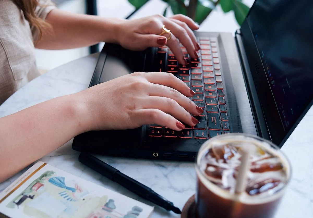
Photo by Iam Hogir
Final Thoughts — Your Website Doesn't Need More Photos. It Needs the Right Photos.
A successful wellness website doesn't need dozens of photographs. It needs photography that supports your brand, your ideal client, messaging, services, and the emotional experience you want to create. So before you’re tempted to select stock photos as you go, use generic stock photos that you’ve seen countless times before, or use photos that don’t accurately represent you or are not relevant, take some time to think about the visual story you want to tell.
If you’ve already had a brand photoshoot or selected intentional stock photos for your wellness website project and are looking for a Squarespace web designer to bring your vision to life, then you might be in the right place.
At Nomadic Virtual Solutions, I’m passionate about helping heart-centered wellness professionals bring their wellness website visions to life in a way that speaks to their ideal clients’ pain points, tells a story, builds trust, and leads to clearly defined CTAs.
If you have something in mind, feel welcome to tell me about it here so we can see if we’re aligned for your exciting project.