Let Your Website Hold the Same Care You Offer Your Clients
You put real thought into your therapy room or massage space. The lighting is soft. The chair is comfortable. Nothing feels accidental, because you know that environment affects how safe someone feels before a single word is spoken.
Your website is usually the first thing a potential client sees. And for most wellness practitioners, it doesn't look or feel anything like the actual practice.
That disconnect costs real clients. Someone finally worked up the courage to search for a therapist or a massage professional. They land on your site, feel nothing in particular, and close the tab. Your work didn't fail them. Your website just didn't give them a reason to stay.
This is exactly what the idea of a digital sanctuary addresses. Your website can carry the same care and intention as your physical space. This post covers what that looks like in real, practical terms.

Photo by RDNE Stock project
Your Website Is Already Communicating Something
Before a visitor reads a single word of your bio, they have already formed an impression. They are reading the room, the same way a client does when they first walk through your door.
Here is what different website choices tend to communicate:
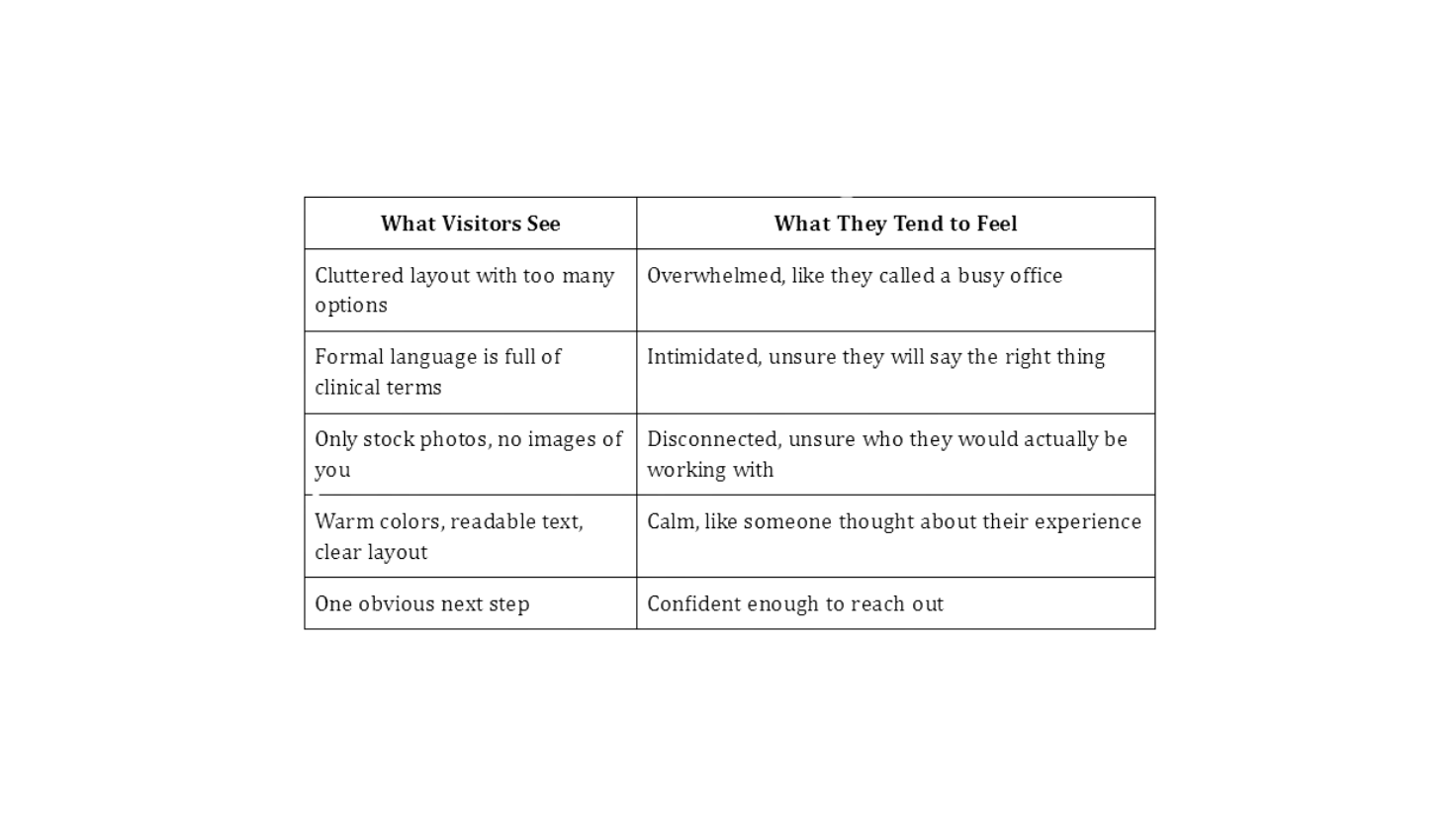
Your site is already doing this work. The real question is how intentionally.

Photo by Shotkit
What Trauma-Informed Design Principles Look Like Online
Trauma-informed design principles in a digital context come from the same framework you likely already apply in your practice: safety, trust, choice, and empowerment. Applied to a website, these ideas become very specific and very practical.
1. Safety through predictability
Your navigation should be like all other navigation. Buttons should look like buttons. There is no time to mess around when someone is feeling vulnerable and searching for your name. Four to five menu items are enough. You should have a visible contact link without needing to scroll down.
2. Trust through transparency
A short paragraph explaining what happens in a first session does more for bookings than a full credentials list. People are not trying to verify your qualifications. They are trying to feel less scared. Give them something concrete to hold onto.
3. Choice without overwhelm
If you have more than one service, you don't have to equally promote all of them on your homepage. Start with who you work with and their problems. You can let the rest of the website tell the rest of the story.
4. Your actual voice
Trauma-informed doesn't mean stuffy. It means honest. Write how you would introduce yourself to a client. "I help adults who feel like they are holding it all together for everyone else, but themselves" is more accurate than "I am an evidence-based-modality specialist". People don't come looking for modalities. They are searching for the right person.

Photo by cottonbro studio
Mindful Branding Is Really About Coherence
Mindful branding gets reduced to color palettes and fonts more often than it should. Those matter, but they're not the whole picture. What actually builds trust is consistency across every page. When someone moves from your homepage to your about page to your contact form, the experience should feel like it came from the same person throughout.
Run through this on your own site before you do anything else:
Read your homepage out loud. Does it sound like you?
Look at your images. Are there actual photos of you, or is it all stock photos of strangers in fields?
How long does it take to find your contact information? Anything past two clicks is too long.
Read your bio. Would a nervous first-time client feel welcomed by it, or slightly intimidated?
Small things. But they're usually where the disconnect lives.

Photo by Pavel Danilyuk
What Actually Makes Aesthetic Websites Work
Aesthetic websites in the wellness space are usually good at sparking a mood. Soft colors, clean fonts, generous whitespace. They feel aligned. The problem is when the visual experience is strong, but visitors still leave without knowing exactly who you serve, how to book with you, or if you are even taking new clients.
The practitioners with websites that actually bring in clients tend to share a few things in common:
Their homepage headline names a specific person with a specific problem, not a vague outcome.
There is at least one photo of them in their actual workspace, not a professional headshot against a blank wall.
There is one clear call to action, not five competing options.
Their testimonials are specific. "She helped me stop waking up at 3 am in a panic" works far better than "Highly recommend."
Design earns trust. Copy closes it. You need both working together.

Photo by Ron Lach
Where to Start If Your Site Does Not Feel Like You Yet
Most wellness practitioners built their first website on their own in the early stages. You needed something online, so you put it together, chose a template that felt close enough, and moved forward. At that time, it made sense; it made you visible and let you start sharing your work.
But your clients notice. Not in an obvious way. They can't point to a font or a color and say "this feels off." They land on your page, and something doesn't click. The warmth you bring into the room isn't there on the screen.
Your website has the same job your waiting room does. It tells the person who has just arrived that they have found the right place, that someone here is ready to listen, and that the next step is simple. When your site doesn't carry that feeling, the right clients move on.
DIY gets you started. It rarely gets you where you need to go.
There's no shame in building your first site yourself. However, the longer you stay in DIY mode, the more it works against you:
Hours spent chasing plugins, fixing mobile layouts, and troubleshooting contact forms are hours away from your clients
Templates can't capture the specific feeling of your practice
A site patched together over time rarely reflects who you are now or who you want to attract
Without a clear strategy behind the design, even a decent-looking site leaves visitors unsure what to do next
At some point, the website stops being something you maintain and starts being something that holds you back.
What working with a professional actually looks like.
A web designer doesn't just make things look better. They start by helping you get clear on the basics before a single page is touched:
Who are you trying to reach?
What do you want them to feel when they land on your site?
What do you offer and how should it be presented?
Where are clients coming from, and where do you want them to go?
Why should someone choose you over anyone else in your area?
Those answers shape everything. A professional brings that process to you so the design has a reason behind it, not just a look.
They handle the technical work while you stay focused on your clients
They translate your voice into something a visitor can feel
They build something that grows with your practice
They take the weight of it off your plate

Photo by kaboom pics
Ready to Build a Website That Actually Feels Like Your Practice?
If this article has made you realise your website isn’t holding the same care and intention as your practice, that’s completely okay. It’s a common place to be. Many wellness professionals reach a point where their online presence no longer reflects the depth of their work, yet they’re unsure what the next step should be.
That’s where we come in as web designers. We work with therapists, heart-centered wellness professionals, massage therapists, life coaches, and mental health practitioners, to build websites that truly support their business growth. Websites that feel calm, clear, and inviting, while attracting the clients they most want to work with.
Let’s have a chat about your website. Together we can look at what’s working, what’s not, and what comes next.